El Bombero
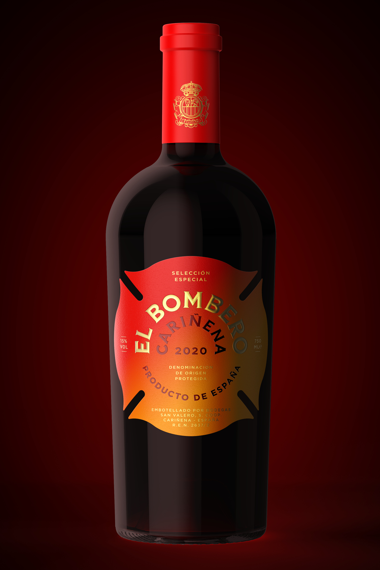
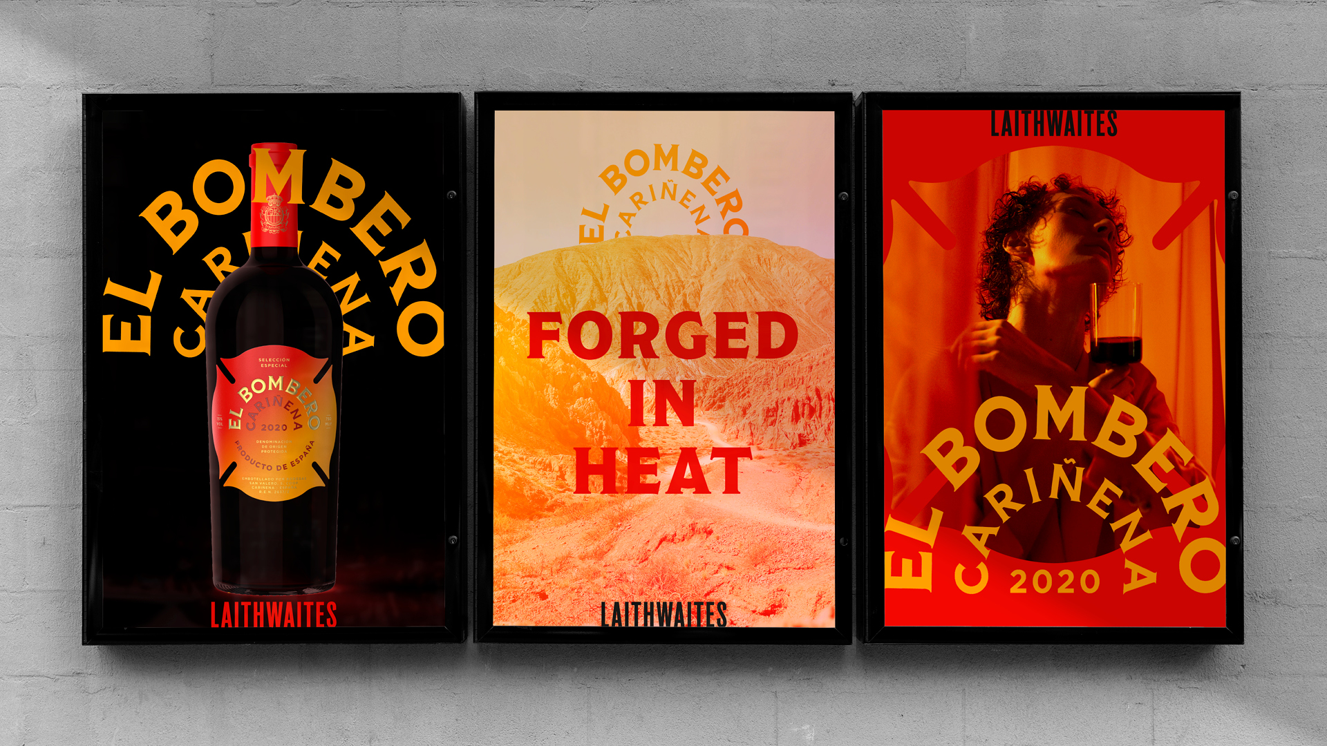
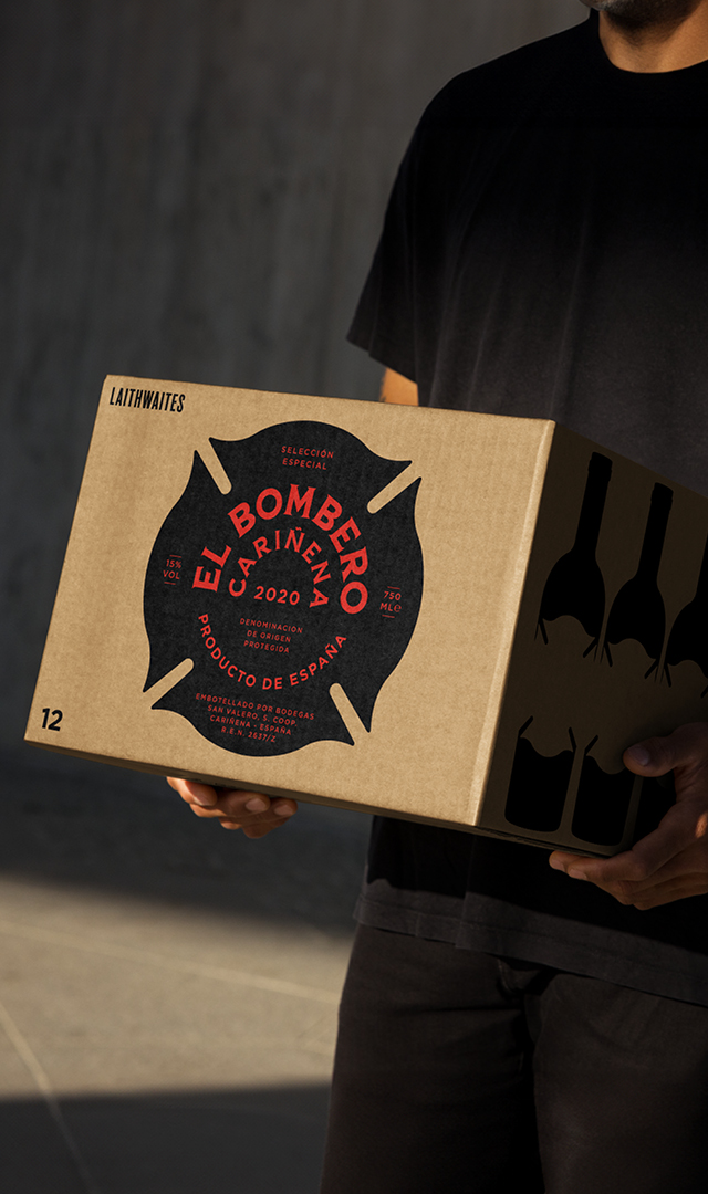
As part of their brand refresh, Laithwaites needed an updated label design for their bestselling Spanish red wine. Meaning ‘the fireman’ in Spanish, El Bombero grapes are grown in the hot, arid climate and cool night temperatures of spain that create an incredibly unique depth and intensity in flavour.
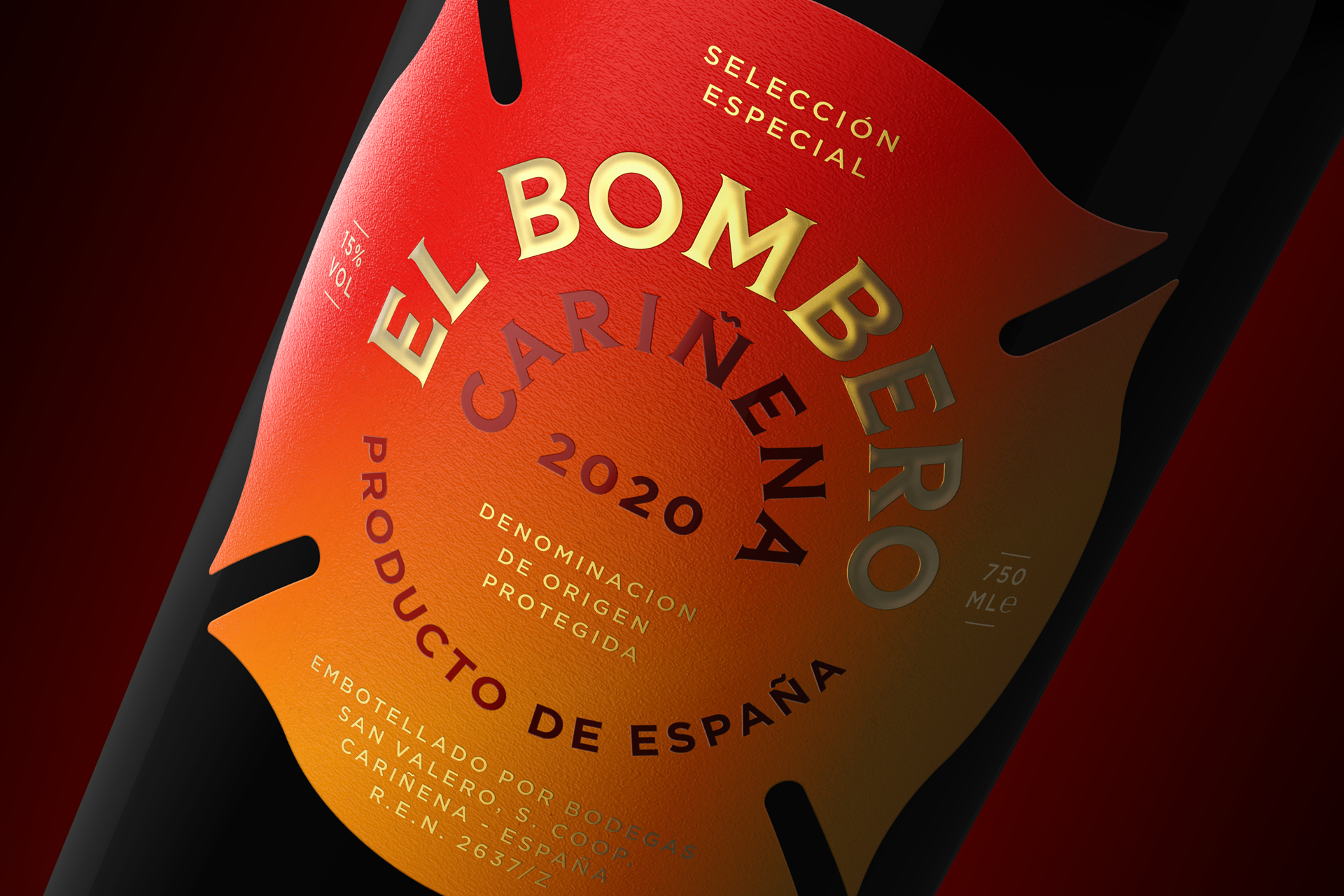
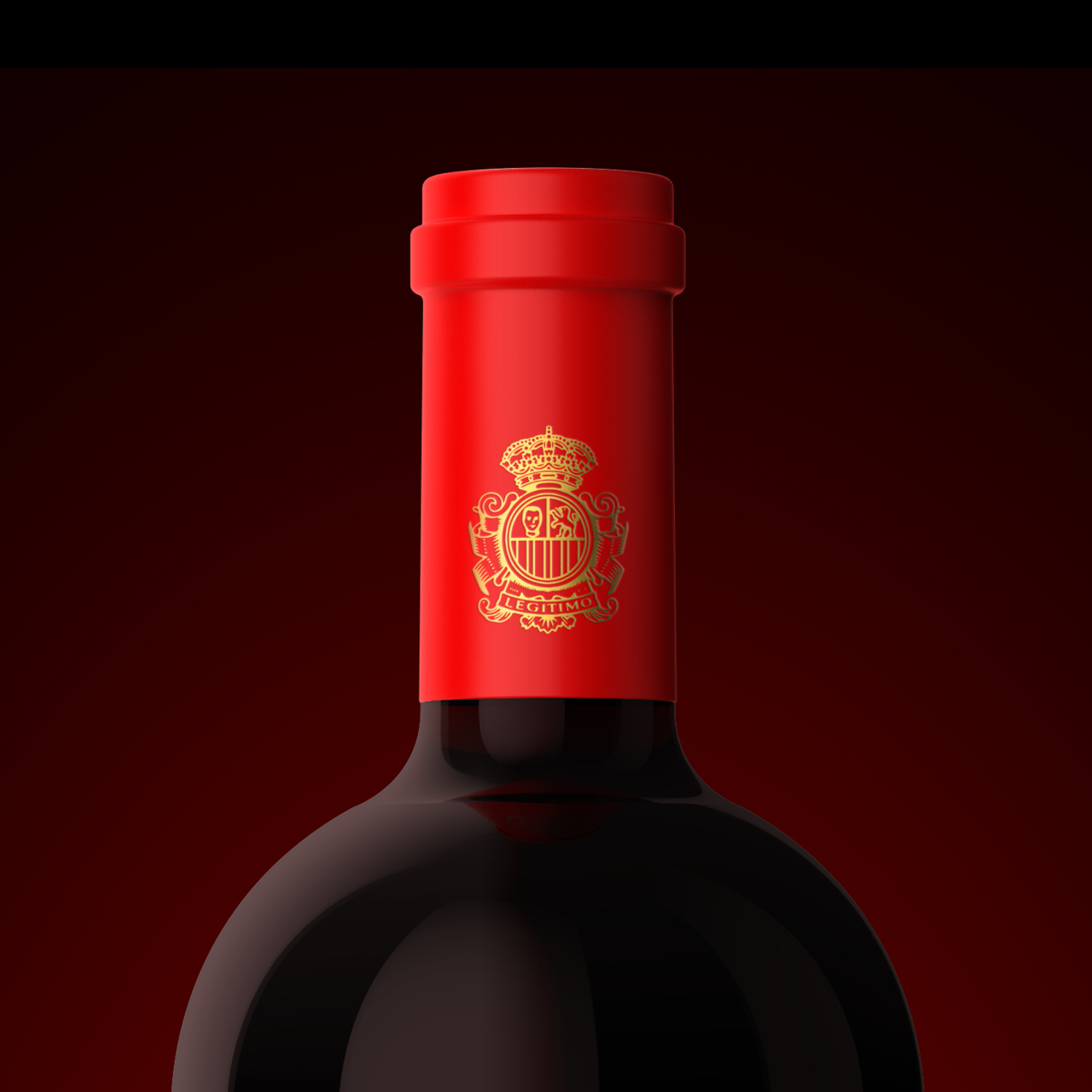
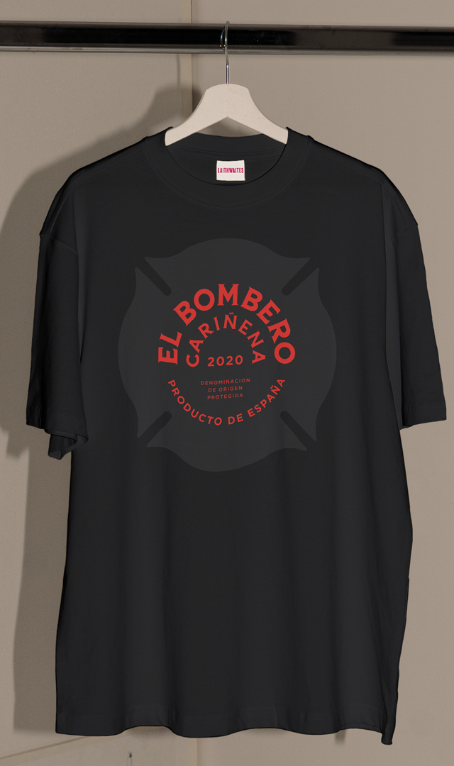
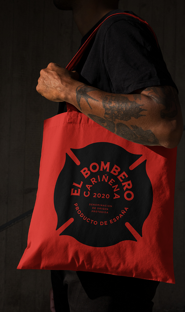
The original label was fusty and boring, and the client wanted to inject some meaningful storytelling into the new design. We took the iconic shape of a fireman’s badge to form the shape of the bottle label, which houses a burning orange and red gradient nodding to both the spanish flag and the intense climate of the reigon. Gold foiled radial sundial typography alludes to the Spanish sun over the landscape.
Client- Laithwaites Wines
Agency- LOVE
Role/s- Creative
Labels- Branding, Packaging, Art Direction
